
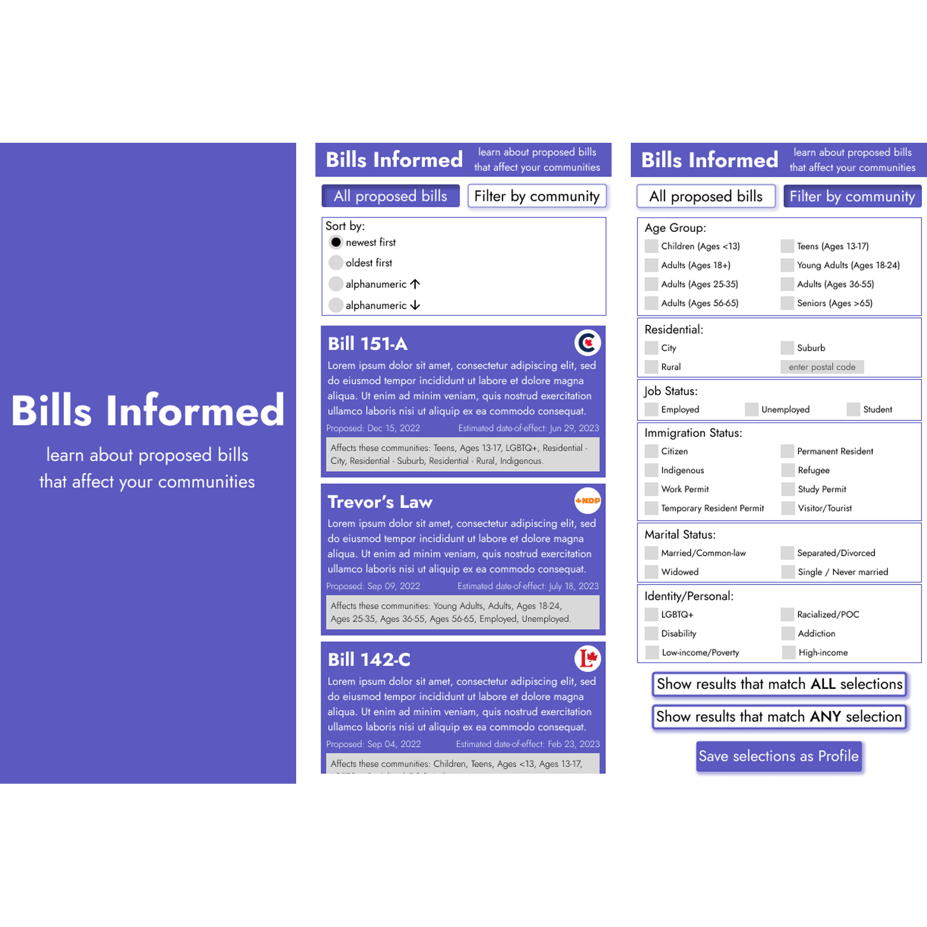
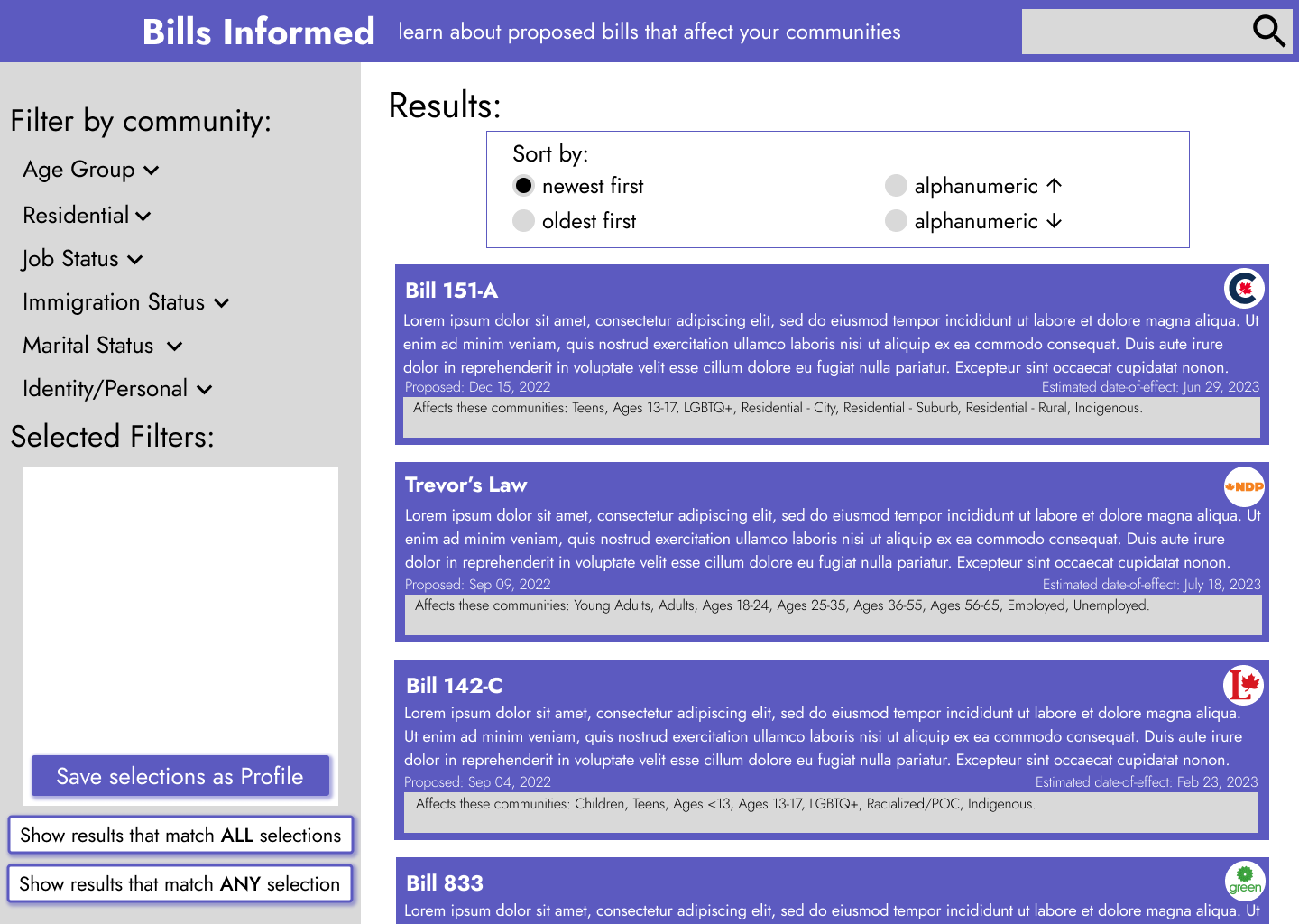
Bills Informed is a tool for users to learn about proposed bills that
affect their communities.
It has filtering options for users to select
their relevant communities,
and results can be sorted in different
ways.
Bills Informed is a tool for social good that aims to keeps users
informed of the effects of proposed legislation.
December 08, 2022 - December 20, 2022
Proposed legislation can be hard to fully understand and keep track of,
and
following all of them is not always relevant or applicable to some users.
By putting important political information in one place and creating filtered options, it makes it easier for people to stay informed about how their communities may be affected and even allow them to be more involved (i.e. voting, community engagement, leadership opportunities).
UX Designer and UX Researcher,
from conception to delivery.
Creating user personas, performing competitive auditing and reporting, user journey mapping, paper and digital wireframing, low and high-fidelity prototyping, conducting usability studies, accounting for accessibility, and iterating on designs.
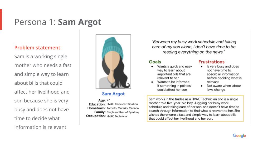
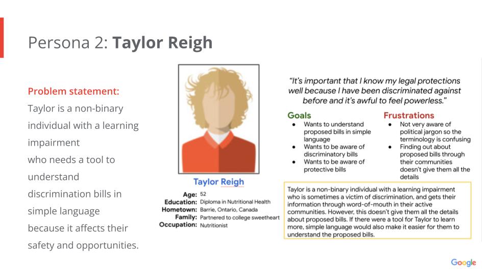
I conducted interviews and created empathy maps to understand the users I’m
designing for and their needs. A primary user group identified through research was people who want to
stay informed about proposed legislation, and how it may affect them personally.
The user group
confirmed that a one-stop place to view all proposed legislation is very useful and informative. They
also showed that knowing which party proposed which bill will help them in their voting decisions,
enabling them to be more active voters. There is currently a gap in the market for this type of tool.
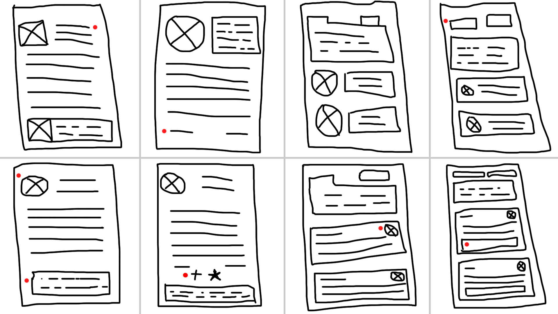
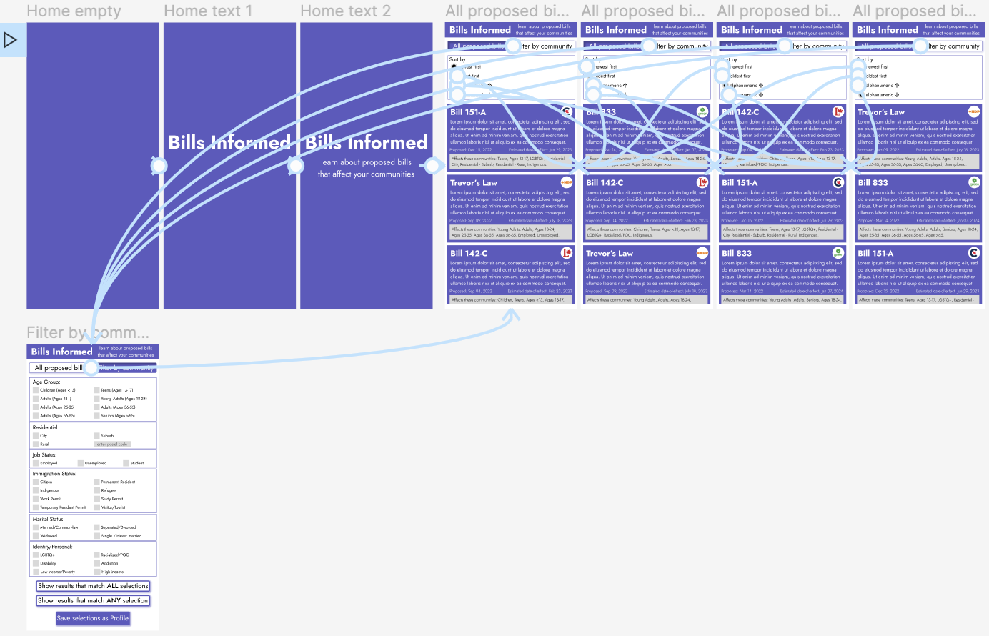
Using a Crazy 8s exercise, I thought of designs for the bills information/details screen and the all bills results screen.
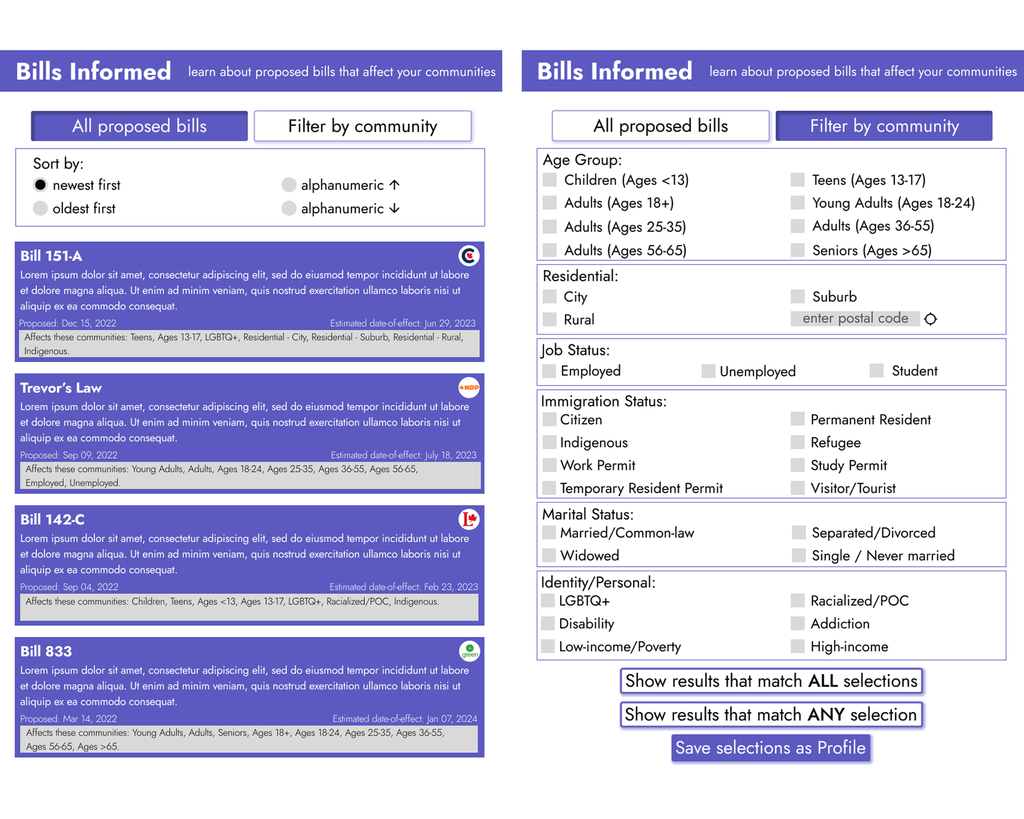
There was feedback that filtering by community is an important function, but users should first be able to see all proposed bills. The amount of information conveyed on this initial screen is also important (i.e. proposal date, effective date, political party, communities affected).
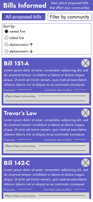
Upon opening the app, users are brought to the all proposed bills page where they have various sorting options. Users can also choose to instead filter results by communities. Feedback implemented was the parameters to include for the filter options.
Users want to know which party proposed which bill.
Users want to know the timeframes.
Users often belong to multiple communities.
Legislative bills are very text-heavy, so the font choice, style, and size had to be carefully chosen to be readable especially for users without perfect eyesight.
Emphasis on certain elements help draw attention to the most important information, and other information is kept at relatively the same location to be faster and easier to understand.
Community filter options have been designed to be inclusive and to avoid biases/judgement in phrasing.
Tablet screen sizes were designed for slightly differently, to account for the bigger screen size and space available.
Desktop design is quite different but still complementary to the mobile design, to account for the bigger screen size and space available. More text is also allowed here as reading large chunks of text is more doable on desktop.